 01
01GYM INTERIOR
THE STRENGTH CULTURE
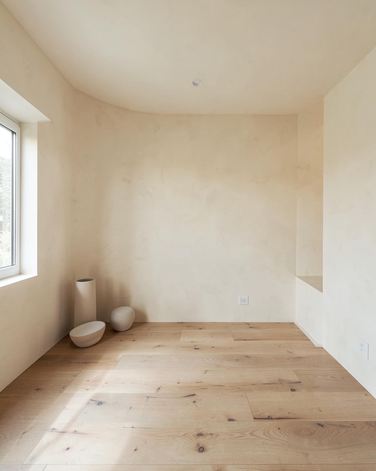
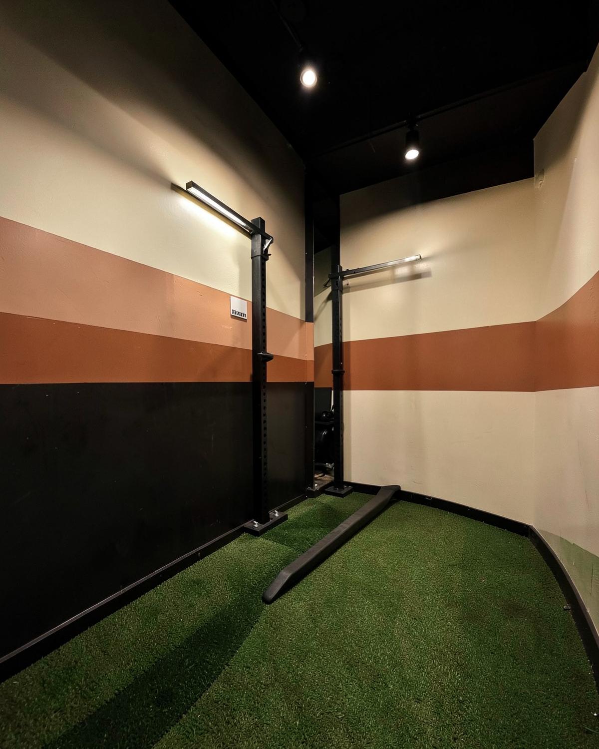
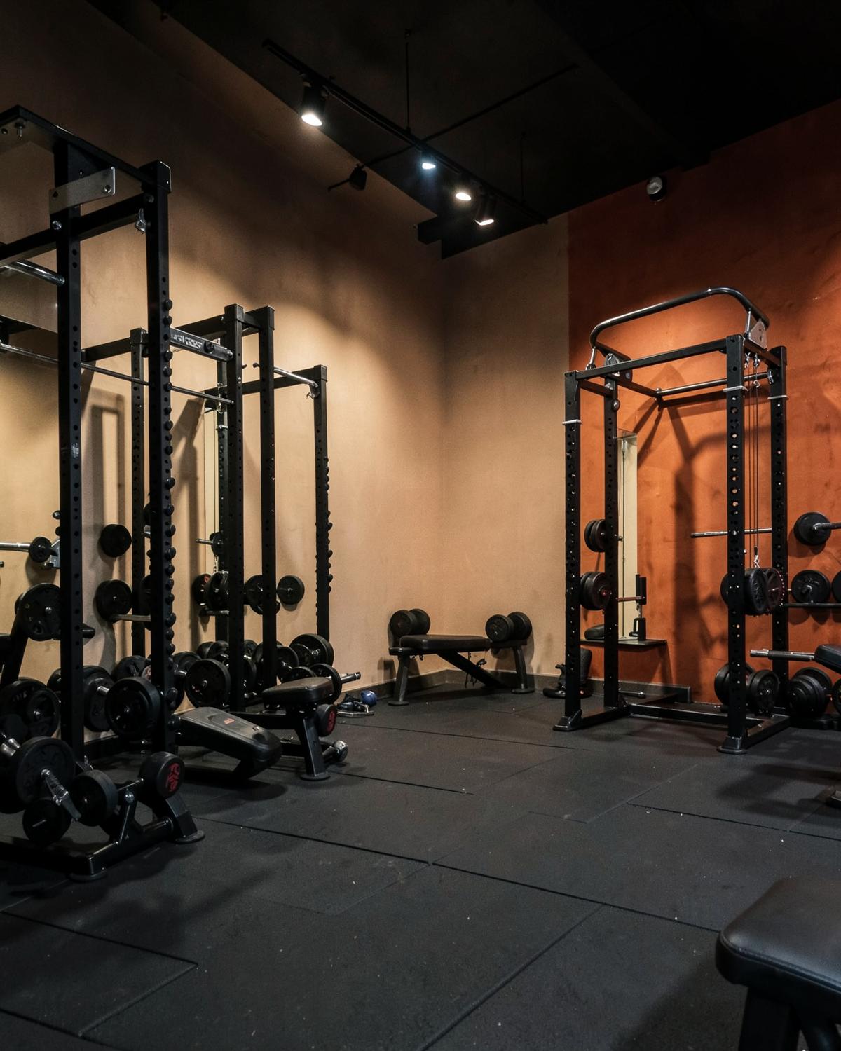
A strength-focused gym designed around clear circulation, equipment flow and focused training.
Jammu (J&K), India
DESIGN DIARIES

GYM INTERIOR
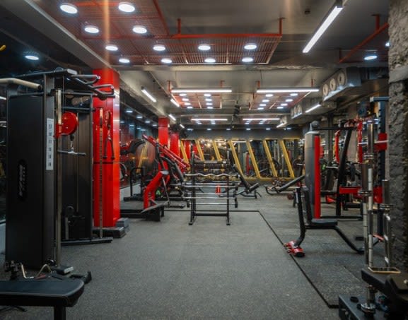
A community-focused gym bringing its red and black identity into a balanced, functional interior.
01 Location
Rohini, Delhi, India
02 Project type
COMMUNITY FITNESS GYM
Inside the project
A strong brand identity can be a great starting point, but bringing it into an interior takes balance. Q3 Fitness needed its red and black identity to remain recognisable while creating a space that still felt comfortable and functional.
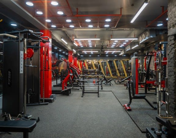
Frame 01
A community-focused gym bringing its red and black identity into a balanced, functional interior.
The case study
The project is shown in the same order it was solved — beginning with the business brief and ending with what the studio carried forward
The brief
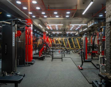
The client wanted to create a gym that could be loved by a wide audience while building on the existing Q3 Fitness brand identity. Red and black were already an important part of the brand, so the interior needed to carry those colours into the space.
The user
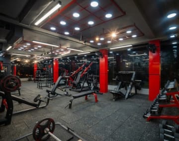
The goal was to create a community-based fitness environment that felt welcoming to different users. The space needed to have the energy of the brand without becoming visually overwhelming for the people using it every day.
The constraint
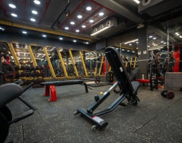
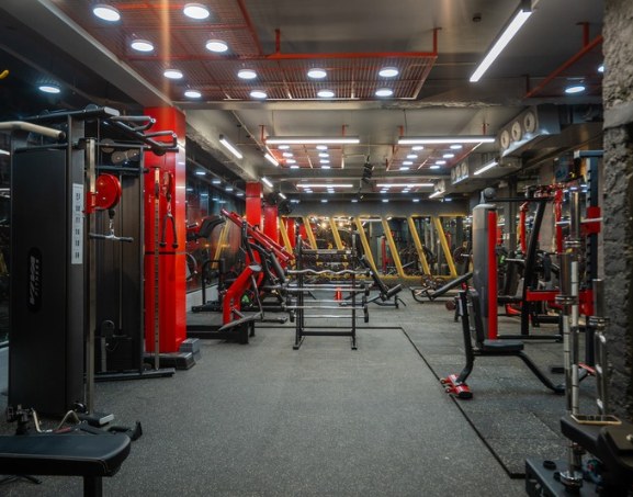
The biggest challenge was the bright red colour the client strongly wanted to use. The site also had a large facade with only two walls available for design, making machine placement and mirror positioning particularly challenging.
The move
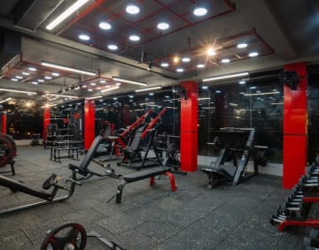
Instead of allowing red to dominate the interiors, we used it in smaller elements and allowed grey to become the stronger visual base. Equipment and mirrors were carefully positioned around the limited wall surfaces so that the functional requirements still worked with the design.
The result
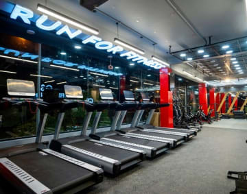
The final interior maintained the recognisable character of the Q3 brand while creating a more balanced environment for training. The placement of machines and mirrors was carefully worked out so that the large facade did not become a limitation to the workout floor.
The learning
This project taught us how to work with a strong visual preference without allowing it to dictate every design decision. Sometimes the better solution is not to remove something challenging, but to find the right amount of it.
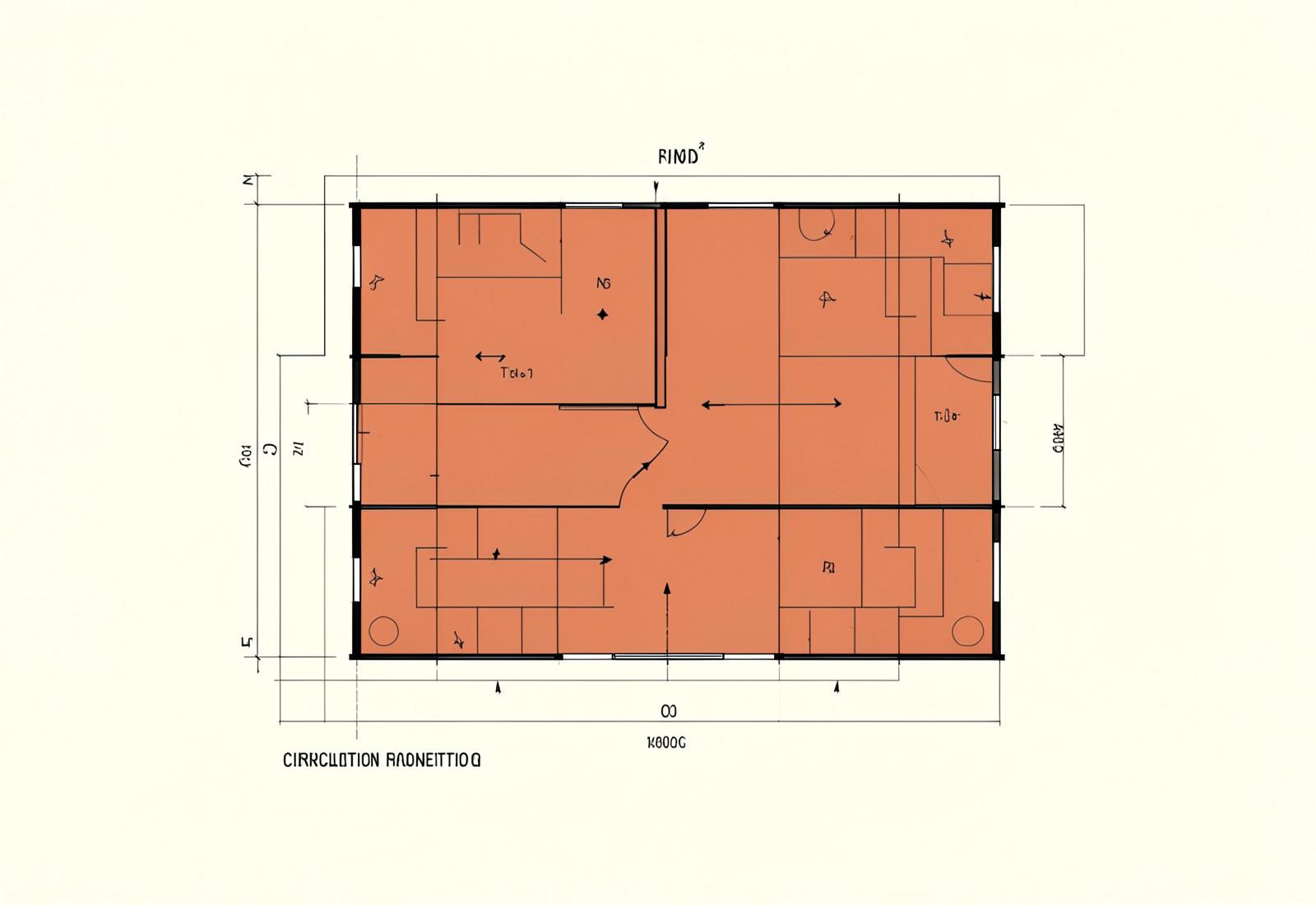
Zoning study
Plan before palette
The layout had to account for equipment placement, mirrors and the limited number of usable walls before the visual identity could be brought into the space.
Equipment · Mirrors · Branding · Balance
Client Words
A community-focused gym bringing its red and black identity into a balanced, functional interior.
Client
Q3 FITNESS
Discuss a Similar Space
Tell us your floor area, location and what you want to build. We can explore how the space can be planned around your training needs.